What’s on Press: Southwest Dinner Menus

Southwest Letterpress Menu | Iron Leaf Press

Last year I met a paper-loving couple and worked with them to design and print a menu for their (delicious sounding) dinner party. When they decided to host another event this year, they wanted letterpress menus to go with their southwest theme.
Southwest Letterpress Menu | Iron Leaf Press

With their theme, I couldn’t resist using two shades of cactus green. I mixed a few old style serif typefaces with a sans-serif to reflect a bit of southwest style with a modern twist.
Southwest Letterpress Menu | Iron Leaf PressThanks to Sam & Diana for their support (and super fun letterpress projects!).


What’s on Press: Bandwidth Pool Stationery

Blind Impression Letterpress | Bandwidth Pool | Iron Leaf Press

Working with other entrepreneurs is one of my favorite parts of my business! Ben at Bandwidth Pool came to Iron Leaf Press looking for some special notecards. He loved the looked of blind impression (printing without ink, leaving just a depression into the paper). We printed his logo on 110# bright-white cotton paper and chose bright blue envelopes to match his logo.
Blind Impression Letterpress | Bandwidth Pool | Iron Leaf Press

Check out more about Bandwidth Pool here. Thanks Ben!


What’s on Press: Blush and Gold Wedding Invites

Blush & Gold Wedding Invites | Iron Leaf Press

We’ve been loving the look of metallics in weddings this summer. Catherine and Shane came to Iron Leaf Press looking for invites for their June wedding, with a blush and gold palette. We worked on a look that matched their casual, elegant wedding celebration, pairing a swash-filled script with some Roman small-caps. Continue reading →

What’s on Press: Business Cards

Letterpress Business Cards | Iron Leaf Press

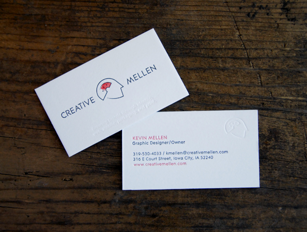
Kevin at Creative Mellen has a great tradition of getting new cards at the beginning of each new year. This year we got the chance to collaborate with him on his newest business cards.

Letterpress Business Cards | Iron Leaf Press

After testing a few different paper stocks, Kevin’s design was printed on double thick cotton paper, measuring almost an 1/8″ thick. With two ink colors, plus a blind impression on both sides, the cards ran through the press six times before they were finished. The double thick paper lends well to a nice deep impression on the cards.

Looking for new cards? Let’s work on something together − email us.